When it comes to planning your wedding, one of the most exciting (and sometimes overwhelming!) parts is choosing your colour palette. Your colours set the tone for your big day – from your florals and bridesmaid dresses to your décor and, of course, your wedding stationery.
As the creative mind behind Indy Bee Crafts, I’ve had the joy of helping couples bring their wedding visions to life with bespoke stationery that reflects their unique style. And let me tell you – your colour palette can completely transform your invites from “just paper” into something that feels so you.
So, let’s talk about how to find your perfect wedding colours – and how to pair them with stationery that ties everything together beautifully.
Start with What You Love
This might sound simple, but the best colour palettes come from you. Think about what colours you’re naturally drawn to – in your wardrobe, home décor, even your Instagram saves. Do you love soft pastels, rich jewel tones, or something timeless like black and gold?
💡 Tip from me: Look through Pinterest boards or even nature for inspiration. I often create stationery based on wildflower hues, earthy tones, and seasonal palettes – it’s amazing what ideas can bloom from a favourite flower or landscape!

Think About the Season
Your wedding season can help guide your colour choices. Here’s a quick cheat sheet:
-
Spring: Blush pink, sage green, lilac, soft peach
-
Summer: Coral, turquoise, sunflower yellow, dusty blue
-
Autumn: Terracotta, burgundy, olive green, mustard
-
Winter: Navy, emerald, silver, deep plum, ivory
Each season has its own vibe, and your stationery can echo that feeling with matching tones and textures. For example, I love adding warm handmade paper for autumn weddings, or a touch of gold foil for winter elegance.

Create Balance with 2–4 Main Colours
A good palette usually includes:
-
1–2 dominant colours (your stars 🌟)
-
1 or 2 accent shades (your supporting cast 🎨)
-
Optional: a neutral base like ivory, grey, or kraft paper to let it all breathe
I always recommend couples avoid going too matchy-matchy. A little contrast makes your stationery pop! For example, pairing dusty rose with warm taupe and a hint of gold foil gives such a dreamy romantic feel without being overdone.

Match Your Colours to Your Stationery Style
Here’s where the magic happens! Once you’ve narrowed down your palette, think about how those colours can be used in your stationery suite:
-
Minimalist or Modern? Think clean typography with bold accent envelopes or belly bands.
-
Boho or Rustic? Watercolour florals and earthy tones work beautifully.
-
Romantic or Classic? Soft scripts, vellum wraps, and pastel shades bring timeless elegance.
💌 At Indy Bee Crafts, I offer custom colour matching and sample sets, so you can see how your colours look in real life – not just on a screen.
Test Before You Commit
Colours can look very different depending on paper type, lighting, and print style. That’s why I always suggest ordering a sample pack (which I’m more than happy to help you with!). It’s a small step that can save a lot of stress later.
And remember – this is your wedding. There are no strict rules. If you want mustard yellow and midnight blue, go for it. Your day should feel authentically you.
Final Thoughts from Me
Choosing your wedding colours should feel fun, not stressful. Whether you’re a lover of bold statement tones or soft, delicate pastels, your stationery can beautifully reflect your vision.
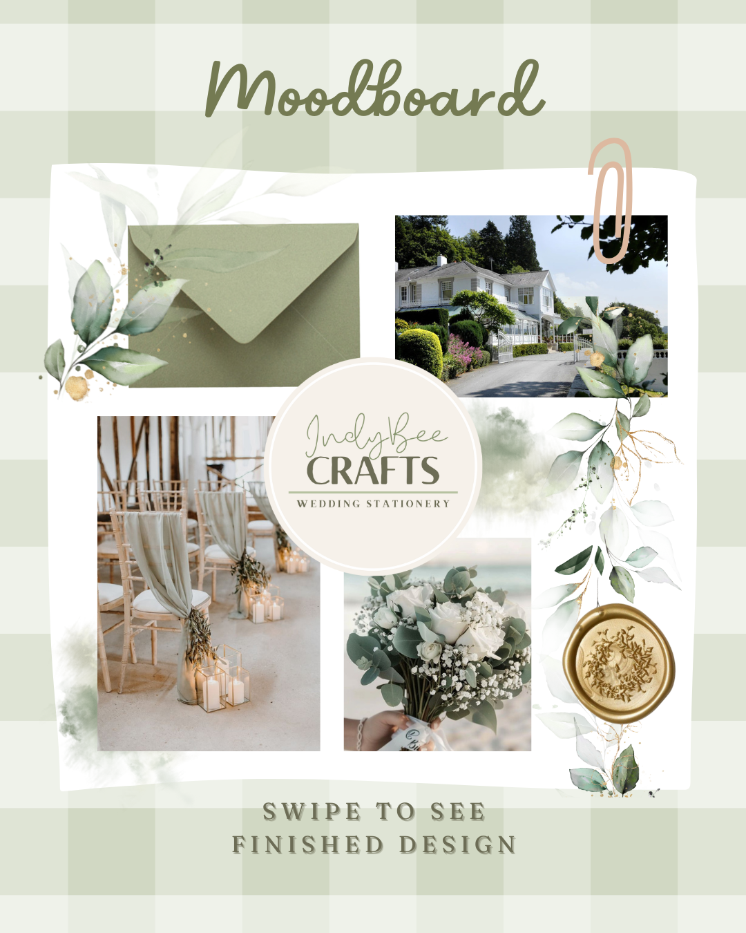
If you’re still unsure where to start, I’m here to help. Just drop me a message and we can chat about your ideas – or even create a mini mood board together. 💛 You can also book in an appointment here or download my brochure to see my process and pricing
Pin it for later: I’ve created a few inspiration pins to help you visualise your favourites – perfect for saving to your wedding planning board!


